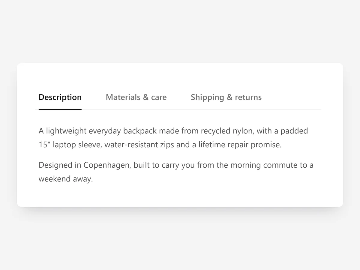
On a wide screen, horizontal tabs let shoppers see every topic at once and switch with one click. The catch is mobile, where a row of tabs gets cramped fast.
Why it matters
Stores with rich product information, such as technical specs, ingredient lists or detailed care, need a compact way to present it. Stacked rows push content far down on desktop, where there is plenty of horizontal space.
Classic tabs solve desktop but break on phones: labels get cut off or scroll sideways out of view. A section that switches layout by screen size avoids choosing between the two.
What the section does
Product Tabs #2 shows details as horizontal tabs on desktop and turns them into an accordion on mobile. Pick it over the free Product Tabs section when your product page has width to spare and you want all topics visible side by side.
- 01Choose underline, pills, boxed or minimal tab styles to fit your theme.
- 02A sliding active indicator moves to the selected tab, so it is always clear what is open.
- 03On mobile the tabs become an accordion, which keeps labels readable on small screens.
- 04Tabs are keyboard accessible, so they can be used without a mouse.
Where to place it and what to write
Place it below the product gallery and buy area, spanning the full width of the page. It also works on content pages that compare several topics.
- 01Use three to five tabs; more labels will not fit in one row.
- 02Keep labels to one or two words: "Details", "Specs", "Care", "Shipping".
- 03Make the first tab the one most shoppers need.
Set it up in three steps
Afterwards, compare desktop and mobile previews to confirm the switch to an accordion and test the tabs with the keyboard. Check the theme font is used. Speed is unaffected, because the block renders plain HTML and CSS.
- 01Open Product Tabs #2 in Section Store, choose a tab style and add the tab content in the visual builder.
- 02Click Theme blocks, then Add to theme; the theme editor opens the product template with the block placed.
- 03Move it below the buy area and save.
Conclusion
Horizontal tabs give desktop shoppers a compact overview and still read well on phones. The Product Tabs #2 section is a one-time purchase of $14.99 in Section Store, or part of the Enterprise Plan.
Key takeaways
- 01Horizontal tabs suit wide product pages with several topics.
- 02The layout turns into an accordion on mobile automatically.
- 03Keep tabs few and labels short.
Explore more