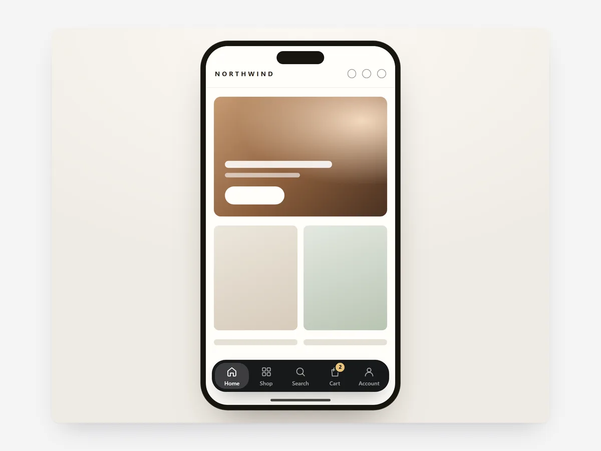
On a large phone, the menu and cart icon sit at the top corner, the hardest place for a thumb to reach. Shopping apps solved this with a bar at the bottom, and shoppers use it without thinking.
Why it matters
When the cart and search are out of thumb reach, shoppers scroll back to the top or simply stop. Every extra stretch of the hand is a small reason to put the phone down.
Mobile Tab Bar keeps the main actions at the bottom edge on every page. Pick it when most traffic is mobile; on desktop, the normal header does the job. It works next to the Sticky Add to Cart section, stepping aside when that bar is shown.
What the section does
Mobile Tab Bar adds a fixed bottom navigation on phones across home, collection, product, cart and content pages.
- 01Three to five tabs can link to pages or open search, the cart, the menu or a wishlist.
- 02A live cart count updates as products are added, and search opens full-screen with predictive results.
- 03The bar hides while shoppers scroll down to read and returns when they scroll up, and it steps aside for a sticky add-to-cart bar.
- 04It can show icons with labels, a floating pill or icons only.
Where to place it and what to write
Add it once so it appears site-wide. Decide on the tabs by what mobile shoppers do most: browse, search, check the cart.
- 01Use four tabs for most stores: Home, Shop, Search, Cart; add a fifth only if it is used often.
- 02Keep labels to one word so they fit under the icons.
- 03Put Cart on the far right, where thumbs expect it in shopping apps.
- 04Choose icons only if the icons are universally clear.
Set it up in three steps
After saving, scroll a product page on your phone: the bar should hide on the way down, return on the way up and give way to the sticky add-to-cart bar. Labels use your theme's font by default. Speed is unaffected, because the block renders plain HTML and CSS.
- 01Open Mobile Tab Bar in Section Store, choose the tabs and style, and check the live preview on mobile and tablet.
- 02Click Theme blocks, then Add to theme; the theme editor opens with the block already placed.
- 03Save, then check the bar on a product page.
Conclusion
Mobile Tab Bar moves search and cart to where thumbs already rest, on every page. The Mobile Tab Bar section is a one-time purchase of $12.99 in Section Store, or part of the Enterprise Plan.
Key takeaways
- 01A bottom bar keeps search and cart within thumb reach on large phones.
- 02It hides while reading and steps aside for a sticky add-to-cart bar.
- 03Four clear tabs with one-word labels cover most stores.
Explore more