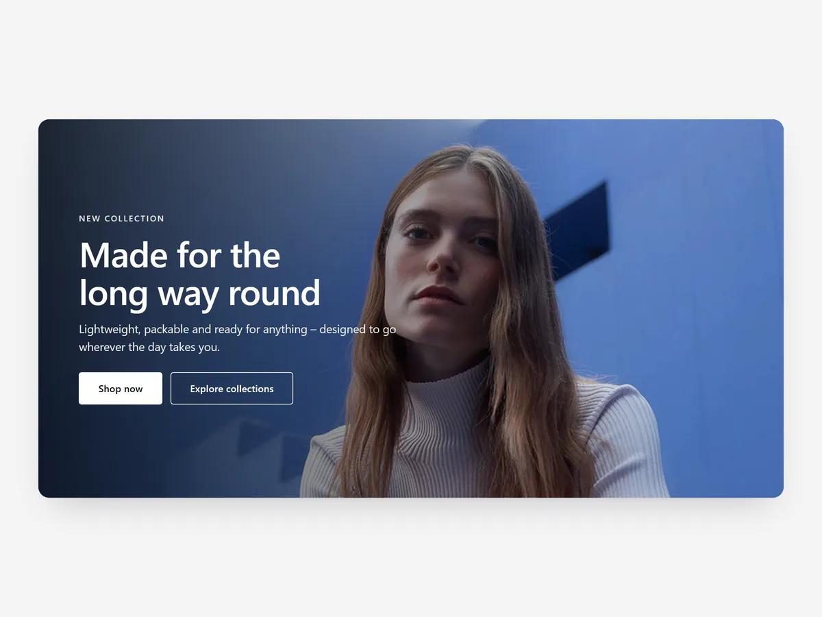
The first screen decides whether a visitor scrolls. Most heroes fail not because the image is weak but because the headline says nothing specific and the button leads nowhere useful. A hero earns its space when a stranger understands what you sell and what to do next without scrolling.
Why it matters
Theme heroes often force a choice: a full-width image with text on top, or nothing. Text over a busy photo becomes unreadable on phones, and the crop that works on a wide monitor cuts the product out of a portrait screen. Merchants then shrink the headline until it says nothing.
This is the still-image sibling of the Hero Slideshow section and the Statement Hero section. Hero Slideshow rotates several slides with their own copy; Statement Hero makes oversized type the picture. Pick Hero when one image and one message should do the work, which is the right call for most stores.
What the section does
The Hero section places an image, a headline, supporting text and two buttons at the top of a page, with layouts that keep the text legible on every screen. It fits the home page, collection landing pages and campaign pages.
- 01Full-bleed, contained or split layouts run the image edge to edge, inside the page width, or beside the text.
- 02Nine text positions let you put the headline where the photo has empty space.
- 03A gradient overlay darkens part of the image so light text stays readable.
- 04A separate mobile image gives phones a portrait crop instead of a landscape photo squeezed into a tall screen.
Where to place it and what to write
Place the hero as the first section of the home page and of any landing page you send paid traffic to. On collection pages, the Collection Header is usually the better fit, because it handles breadcrumbs and filters.
- 01Write a headline that names the product and the result: "Rain jackets that pack into a pocket" beats "Welcome to our store".
- 02Give the two buttons different jobs, one to shop and one to learn; two "Shop now" buttons split clicks.
- 03Keep the supporting line under fifteen words; it is read on a phone, not a poster.
- 04Choose a photo with a quiet area for the text or use the split layout; never fight the picture.
Set it up in three steps
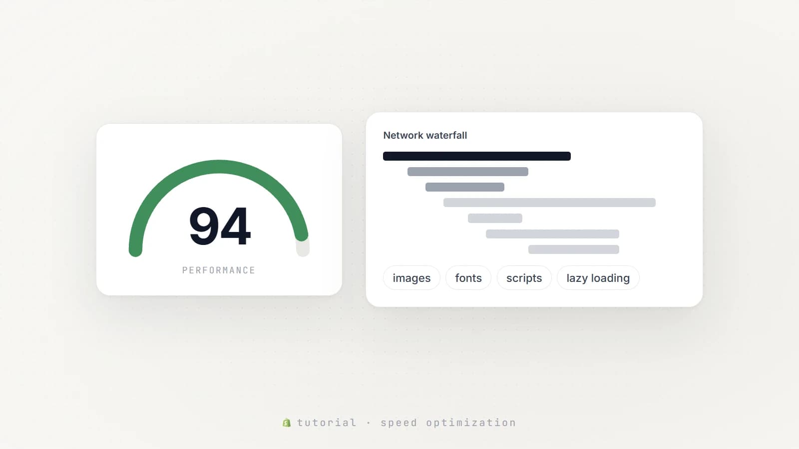
After saving, check the home page on your phone: the headline must be readable over the image, both buttons must sit above the fold and the mobile crop must show the product. Text uses your theme's font by default. Speed is unaffected, because the block renders plain HTML and CSS from your settings; keep the images compressed, since the picture is the only weight.
- 01Open Hero in Section Store, upload desktop and mobile images, write the headline and buttons, pick a layout preset and check the live preview on desktop, tablet and mobile.
- 02Click Theme blocks, then Add to theme; the theme editor opens with the block already placed.
- 03Drag the block to the top of the page and save.
Conclusion
A hero works when a stranger understands the offer in one screen and knows where to tap. The Hero section is a one-time purchase of $24.99 in Section Store, or part of the Enterprise Plan.
Key takeaways
- 01A specific headline and one clear next step matter more than the photo.
- 02A separate mobile image keeps the product in frame on portrait screens.
- 03Pick Hero for one message, Hero Slideshow for several and Statement Hero for type-led brands.
Explore more