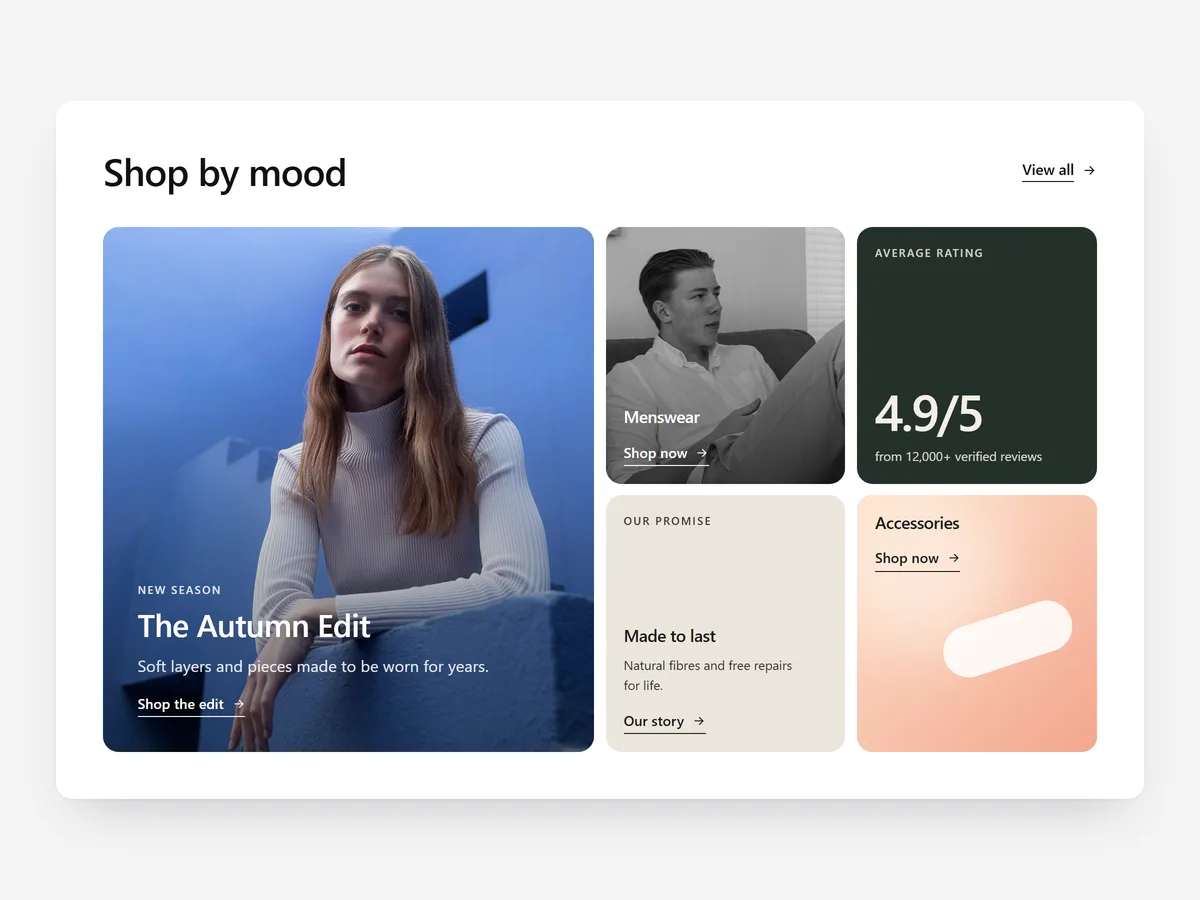
A home page usually stacks one full-width block after another, and each one gets a few seconds before the visitor scrolls on. A bento grid shows several messages at once, so a shopper who scans the first screen already sees your bestseller, your story and your proof together.
Why it matters
Most brands have four or five things a new visitor should know: the hero product, a category, what makes it different, a number worth showing. Spread across five sections, half never get seen. In one grid, the visitor sees them together and picks.
A big tile says "start here", smaller tiles support it, and a stat tile adds a concrete fact.
What the section does
Bento Grid is built for the home page and works well on brand or campaign landing pages too.
- 01Six grid templates give you a balanced layout straight away, and custom spans let you size any tile yourself.
- 02Each tile can be an image, a video, a text block or a stat, so one section carries several kinds of message.
- 03Zoom, lift or reveal hover effects signal which tiles are clickable without extra buttons.
- 04On phones the grid becomes two columns, a stack or a slider, so you decide how it reads on small screens.
Where to place it and what to write
Put it directly below the hero on the home page, where it acts as a table of contents for the brand. On a collection landing page it works as a visual entry into sub-categories.
- 01Give the largest tile your single most important message and keep the rest secondary.
- 02Use five to seven tiles.
- 03Keep tile text to a short headline; the image explains.
- 04Only use a stat tile for a fact you can stand behind, such as years in business or materials used.
Set it up in three steps
After saving, pick the mobile layout that reads best in the preview and confirm the theme font is used. Speed is unaffected because the block renders plain HTML and CSS.
- 01Open Bento Grid in Section Store, choose a template and fill each tile in the visual builder.
- 02Click Theme blocks, then Add to theme, and the theme editor opens with the block already placed.
- 03Position it below the hero and save.
Conclusion
Use Bento Grid when you have several things to say and only one screen to say them on. The Bento Grid section is a one-time purchase of $19.99 in Section Store, or part of the Enterprise Plan.
Key takeaways
- 01A bento grid shows several brand messages in one view instead of five stacked sections.
- 02One dominant tile and a few supporting tiles create a clear reading order.
- 03Choose the mobile layout deliberately, because the grid behaves differently on phones.
Explore more