When a store sells a basic, a plus and a pro version, the hard decision is not whether to buy but which one. Spread over three product pages, that choice often gets postponed for good.
Why it matters
Shoppers comparing your models open tabs and try to remember which one had the larger battery. Every tab switch is a chance to give up.
This section is not for comparing yourself against competitors; that is what the Comparison section is for. Model Compare lines up your own range so a shopper sees the trade-offs, sees your recommendation and buys directly from the table.
What the section does
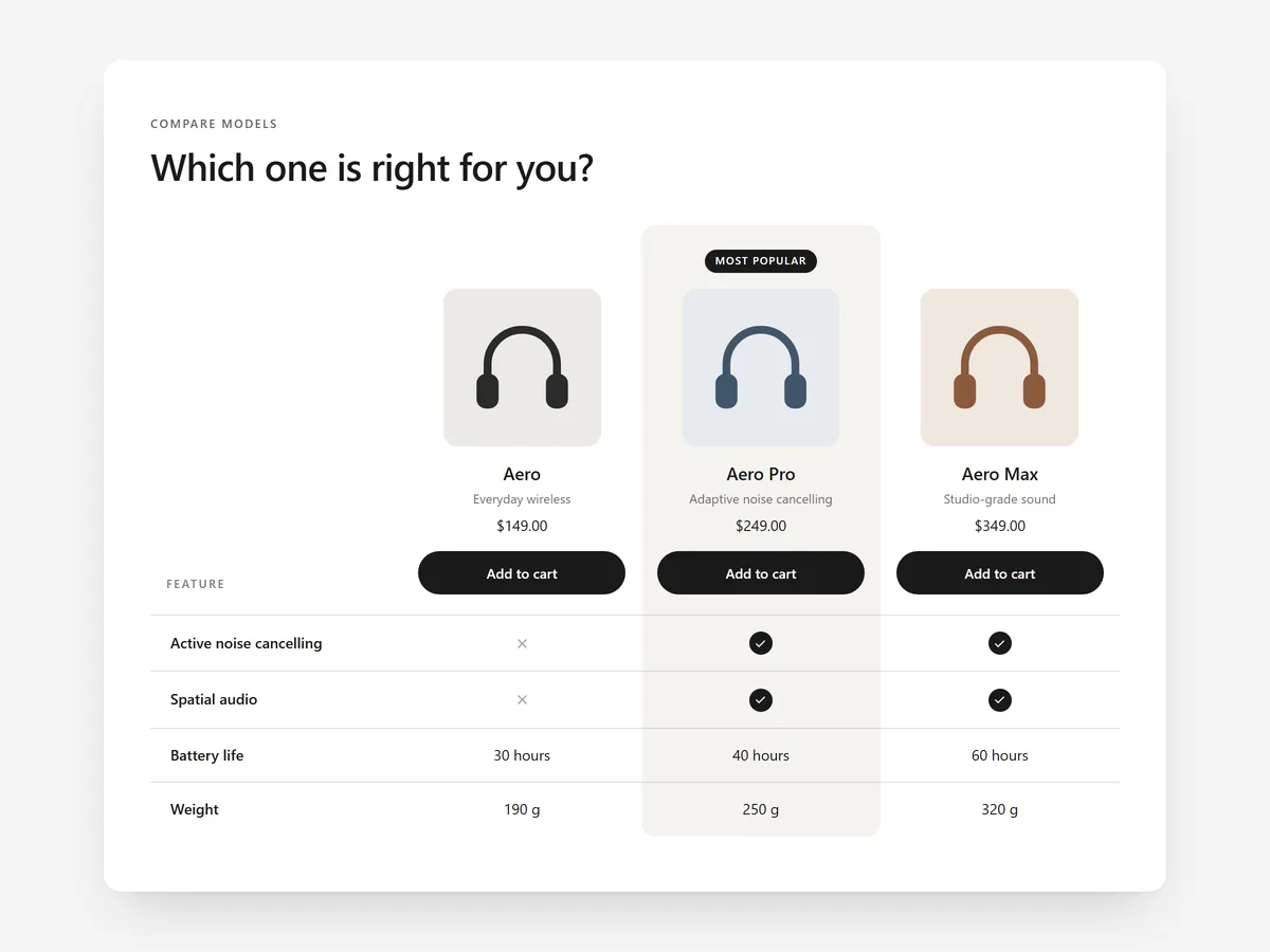
Model Compare shows your models side by side with grouped specs and a recommended pick. It belongs on the product page of a range, on a collection page or on a dedicated 'which model is right for me' page.
- 01You compare two to four of your own models with live prices and an add-to-cart button, so the decision and the purchase happen in one place.
- 02Rows are grouped and can show checks, crosses or values, which keeps long spec lists readable.
- 03An 'only differences' switch hides identical rows, and the model names stay in view while the shopper scrolls.
- 04On phones, shoppers see two models at a time or swipe between them instead of squeezing four columns onto a small screen.
Where to place it and what to write
On a collection page with a small range, place it below the product grid. On product pages, put it after the description so shoppers who are unsure about the version find it before they leave.
- 01Headline the decision, e.g. 'Which grinder fits your kitchen?'
- 02Mark one model as recommended and say who it is for.
- 03Group rows by what shoppers care about first: size, power, what's included.
- 04Drop rows where every model is identical, or let the switch hide them.
Set it up in three steps
After saving, swipe between models in the mobile view, check that prices match the product pages and that the font follows your theme. Speed stays unaffected, as the block renders plain HTML and CSS.
- 01Open Model Compare in Section Store, choose your models and build the grouped rows in the visual builder.
- 02Click Theme blocks → Add to theme to open the theme editor with the block placed.
- 03Position it on the template and save.
Conclusion
A clear side-by-side of your own range turns 'which one?' into a purchase. The Model Compare section is a one-time purchase of $19.99 in Section Store, or part of the Enterprise Plan.
Key takeaways
- 01Model Compare is for your own range; use the Comparison section for competitors.
- 02Live prices and add to cart let shoppers buy straight from the table.
- 03A recommended pick and an 'only differences' view shorten the decision.
Explore more