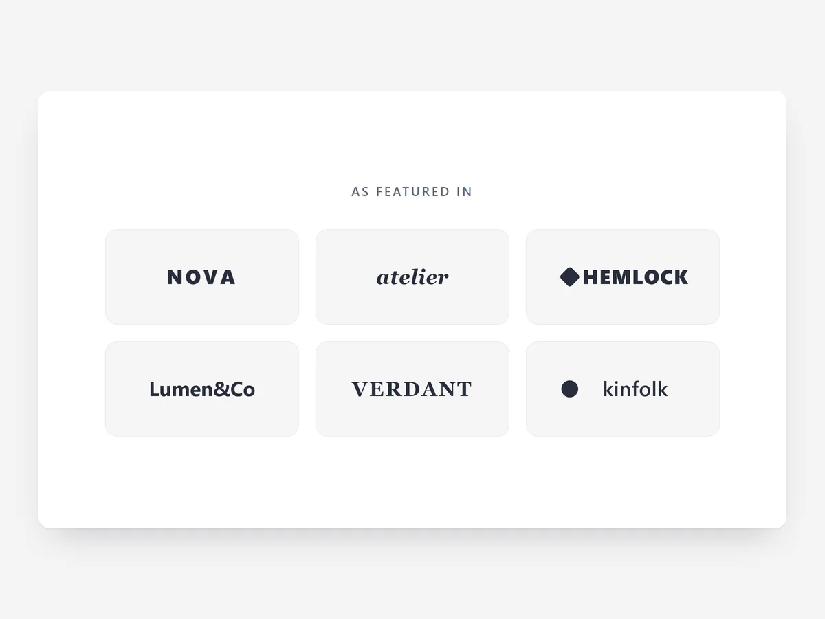
A first-time visitor does not know your brand, but they know the magazines, retailers and certifications you have worked with. A row of familiar logos answers "is this shop real?" in a second, before a word of copy is read.
Why it matters
New brands lose shoppers at the first scroll because nothing on the page connects to something the visitor already trusts. Press mentions, stockists and award logos make that connection, yet most stores bury them in the footer where nobody looks.
The Logo Slider is the quiet sibling of the Press Quotes section. Press Quotes pairs each logo with what the publication wrote; Logo Slider shows the names only, in a strip that takes little height. Pick Logo Slider when you have many logos and little space, or when the logos are stockists and partners rather than press.
What the section does
Logo Slider lines up your logos as an endless marquee or a tidy grid and keeps them visually equal. It fits the home page below the hero, landing pages and the about page.
- 01The seamless endless marquee loops without a visible jump, so the row never looks broken.
- 02Optically balanced logo sizes stop a wide wordmark from dwarfing a compact emblem.
- 03Logos show in grayscale and switch to colour on hover, which keeps the row calm until someone looks closely.
- 04An edge fade softens the ends of the strip, and the motion pauses on hover so a logo can be read.
- 05The grid layout with boxed tiles is the alternative when you want a static, orderly block.
Where to place it and what to write
On the home page, place the strip directly under the hero or under the first product row, where a new visitor is still deciding whether to stay. On landing pages for ads, keep it in the first screen. Use the grid on the about page.
- 01Keep the headline factual and short: "As seen in" or "Stocked by", not "Trusted by thousands".
- 02Use six to twelve logos; fewer than five looks like a grid, not a marquee.
- 03Only show logos you have permission to use and a mention or listing to back up.
- 04Export every logo with a transparent background, otherwise the grayscale effect looks patchy.
Set it up in three steps
After saving, watch one full loop on your phone: it should run smoothly and pause when you touch it, and no single logo should dominate. The headline uses your theme's font by default. Speed is unaffected, because the block renders plain HTML and CSS from your settings.
- 01Open Logo Slider in Section Store, upload the logos, choose marquee or grid and a style preset, and check the live preview on desktop, tablet and mobile.
- 02Click Theme blocks, then Add to theme; the theme editor opens with the block already placed.
- 03Move the block under the hero and save.
Conclusion
Familiar logos make the introduction that a new brand cannot make for itself. The Logo Slider section is a one-time purchase of $12 in Section Store, or part of the Enterprise Plan.
Key takeaways
- 01Recognised logos give a new brand borrowed trust in the first seconds of a visit.
- 02Choose Logo Slider for many logos in little space and Press Quotes when you want to show what was written.
- 03Consistent file formats and transparent backgrounds make or break the row.